The Best Fonts to Use for Houston Channel Letter Signs
Posted by 4D Marketing on Apr 3, 2020
Uppercase or Lowercase Letters for Your Houston Channel Letter Signs?
One of the first decisions you can make is whether you will use uppercase or lowercase letters on your Houston outdoor signage. While this may seem like a small decision, it can have major impacts. Lowercase letters are generally easier to read, which is why most road signs only use capital letters at the beginning of a word, rather than all uppercase letters. Therefore, this style may be best for your Houston channel letter signs, especially in areas where people are more likely to notice your sign when driving by.
By contrast, all uppercase letters on a sign tend to portray a sense of danger or authority. Therefore, you often see all capital letters on warning signs. However, even if you are the authority in your industry, you may need to be careful with uppercase letters. In some instances, people may read this as textual “shouting.”
Having said that, one of the most important parts of your Houston channel letter signs is that they are consistent with your other branding. If your logo contains all uppercase or all lowercase letters, you should typically opt for the same style. Brand uniformity is essential, and your Houston outdoor signs should fit exactly what you wish to portray to the customer.
Serif or Sans-Serif Fonts for Houston Outdoor Signs?
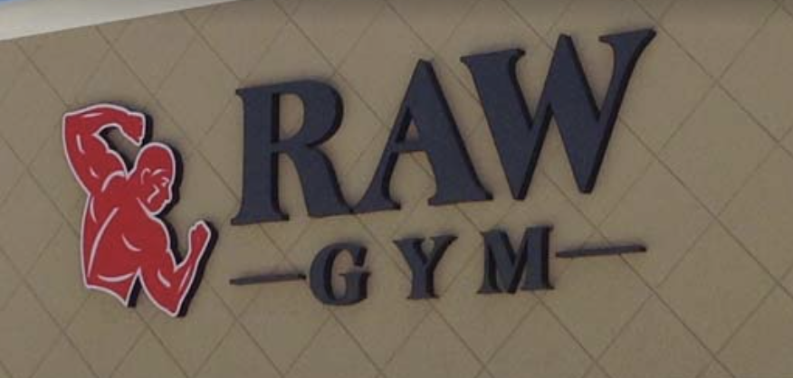
The serif versus sans-serif debate has been around for quite a while. There are pros and cons to each, and many people have different preferences. Generally, sans-serif fonts are easier to read, especially from far away. Therefore, most businesses opt for sans-serif Houston channel letter signs. Serif fonts are more difficult to read because of the “tails” attached to the letters. While they help readers visually flow on to the next word, they are generally better suited to longer text like paragraphs. However, there are a few exceptions to this rule.
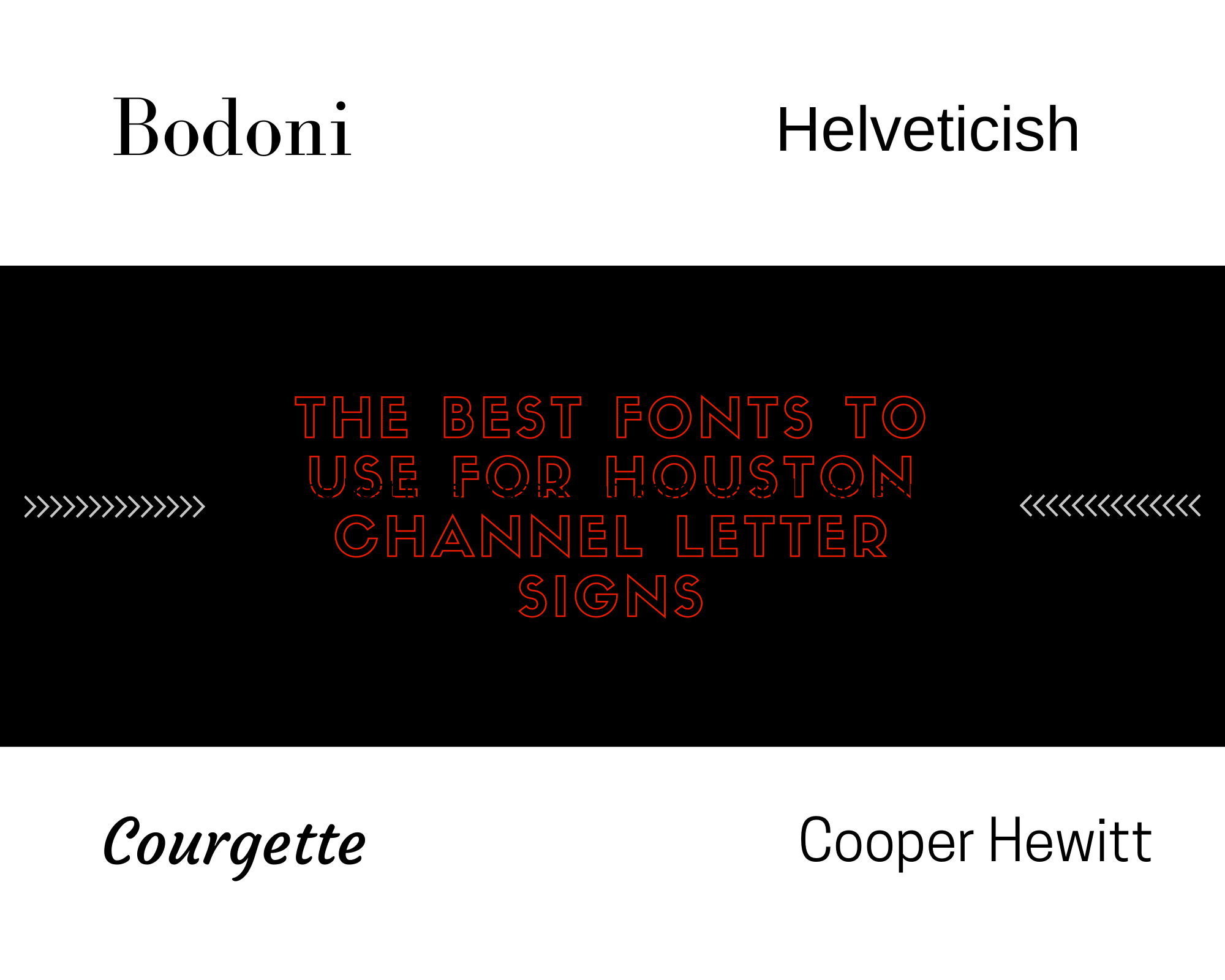
While sans-serif fonts tend to be more popular for Houston outdoor signs, there are serif examples that may work for your signage. For example, the “Bodoni” font is often used in signs and convey a very professional message to consumers. Additionally, while script fonts are generally difficult to read and therefore aren’t often used in Houston channel letter signs, “Courgette” is a legible script font that you may choose to use for your business signage.
If you need custom signage, our team at 4D Signworx can help you design, manufacture, and install signs of all types. We started making signs back in 1968, so we have the experience you need for the best signage outcomes. Our commitment to your complete satisfaction makes us a leading Houston sign company. Call us today at (713) 984-2010 to learn more or request a quote. At 4D Signworx, we are here to serve you.


