How to Choose the Best Colors for Your Outdoor LED Signs
Posted by 4D Marketing on Jan 27, 2025
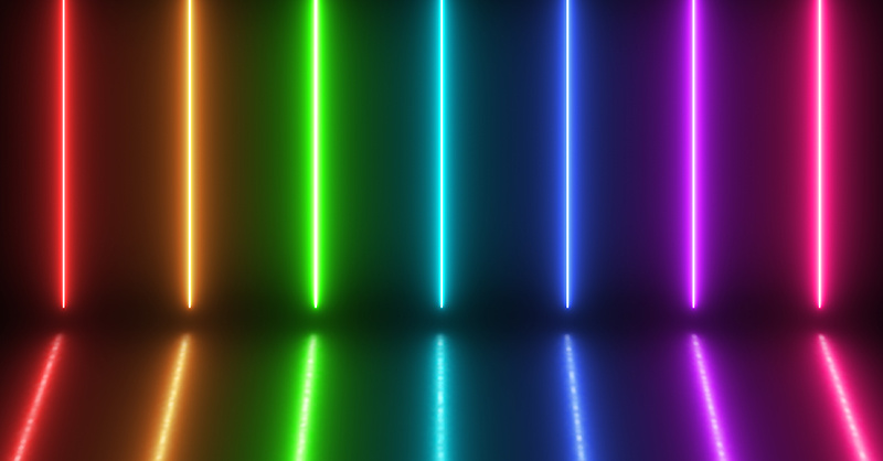
LED signs are a powerful outdoor advertising tool for businesses to capture attention and convey messages effectively. The impact of these signs, however, relies heavily on one crucial factor: color choice.
Digital Signage Today reported that one of the trends for 2024 was an embrace of vibrant color palettes that captivate attention and evoke strong emotions.
“From electric blues and radiant reds to lush greens and fiery oranges, expect digital designs to be a feast for the eyes,” wrote Jennifer Gvozdek for Digital Signage Today. “This resurgence of vivid colors is about grabbing attention and infusing designs with energy and personality.”
Selecting the right colors for your LED sign can mean the difference between a forgettable display and one that leaves a lasting impression on potential customers.
“Help your brand stand out in a crowded digital landscape by leveraging these bold color choices to create memorable and distinctive visual identities,” wrote Gvozdek.
This guide will walk you through the essential considerations and strategies for choosing the best colors for your Houston area LED signs.
Understanding Color Psychology
At the heart of effective color selection lies the science of color psychology. Different colors evoke various emotions and associations, which can significantly influence how people perceive and interact with your brand.
“When it comes to communication, color is unbeatable,” says Hailey van Braam, MA degree in Cognitive Psychology and editor of ColorPsychology.com. “Unconscious or otherwise, color can evoke emotions, inspire reactions, and change modes of thinking. It can excite or soothe your mood, raise or lower your blood pressure, and even whet your appetite!”
Here’s a brief overview of common color associations (note that some associations cross over to more than one color):
- Red: Excitement, passion, urgency, energy, love
- Blue: Trust, calmness, professionalism, stability, intelligence, security, dependability, reliability
- Green: Growth, health, nature, tranquility, wealth, freshness, sustainability
- Yellow: Optimism, clarity, warmth, happiness, youth, affordability, cheerfulness, energy
- Purple: Luxury, creativity, wisdom, royalty, sophistication, mystery
- Orange: Enthusiasm, adventure, confidence, fun, playfulness, creativity, affordability, energy
- Black: Sophistication, power, elegance, luxury, mystery, exclusiveness, modernity
- White: Purity, cleanliness, simplicity, innocence, modernity, minimalism
- Gray: Neutrality, balance, sophistication, professionalism
- Brown: Earthiness, warmth, reliability, ruggedness, comfort, rustic, natural, dependable
- Pink: Femininity, romance, gentleness, playfulness, nurturing
- Gold/Silver: Prestige, wealth, elegance
- Multicolor: Diversity, inclusivity, playfulness
Understanding these associations is crucial in marketing and branding. By aligning your color choices with your brand’s message and values, you can create a more cohesive and impactful visual identity.
3 Factors to Consider When Choosing Colors
Here are three important factors to consider when choosing colors for your outdoor LED sign:
Environmental Context: The physical location of your LED sign plays a significant role in color selection. Consider the following:
- Surrounding colors: Analyze the dominant colors in the environment where your sign will be placed. You may want to choose colors that either complement or contrast with these surroundings to ensure visibility.
- Lighting conditions: Different colors perform differently under various lighting conditions. Bright sunlight, for instance, may wash out certain colors, while others might pop more vibrantly.
- Viewing distance: Some colors are more visible from a distance than others. Consider how far your typical viewer will be from the sign when making your selection.
Brand Consistency: While it’s essential to choose colors that stand out, it’s equally important to maintain brand consistency. Your LED sign should be an extension of your overall brand identity. Consider the following:
- Use your established brand colors as a starting point.
- If your brand colors aren’t ideal for LED display, consider using them in combination with more visible colors.
- Ensure that the chosen colors align with your brand’s personality and values.
Target Audience: Your color choices should resonate with your target audience. Consider factors such as:
- Age: Different age groups may have varying color preferences.
- Culture: Colors can have different meanings in various cultures.
- Industry: Certain colors are associated with specific industries (e.g., green for eco-friendly businesses).
Color Combinations for Maximum Impact
High-contrast color combinations are essential for readability, especially from a distance. Some effective high-contrast pairs include:
- White on Dark Blue: White or yellow text on a dark blue background provides excellent contrast and readability while evoking a sense of trust and professionalism.
- Black and Yellow: Yellow text on a black background. Black and yellow is one of the most striking high contrast combinations with this pairing offering maximum visibility and often used for warning signs and safety notices because of its eye-catching nature.
- Red and White: Red text on a white background or white text on a red background creates a bold, attention-grabbing contrast and is often used for sales and promotions.
- Purple and Yellow: Purple and yellow are complementary colors that create a vibrant, high-contrast combination. This pairing can be used for creative or artistic brands.
- Green and Pink: This uncommon color combination can create an unexpected and visually striking contrast making it a good option for brands wanting to stand out from the crowd.
- Orange and Blue: These complimentary colors provide a strong contrast that projects a lively and energetic visual impact.
Remember, the goal is to make your message stand out and be easily readable.
Pay Attention to Color Harmony
To create visually appealing signs, you need to consider color harmony principles.
“Color harmony in design refers to the balanced and aesthetically pleasing interaction of colors,”explains the Interaction Design Foundation. “Designers use color harmony to influence user experiences, create brand identity, and enhance accessibility. Color harmony is not only about attractive colors but their impact on the overall design.”
It helps to familiarize yourself with color wheels, which can lead to an understanding of:
- Complementary colors: Colors opposite each other on the color wheel (e.g., blue and orange)
- Analogous colors: Colors adjacent to each other on the color wheel (e.g., blue, blue-green, and green)
- Triadic color schemes: Three colors equally spaced on the color wheel (e.g., red, yellow, and blue)
These principles can help you create balanced and attractive color schemes that catch the eye without being overwhelming.
Technical Considerations for LED Signs
Before choosing your LED outdoor signage colors, you should consider technical considerations such as color rendering, legibility and readability.
LED technology has some unique characteristics that affect color appearance:
- Color mixing: LEDs use additive color mixing (RGB), which can affect how colors appear compared to traditional printing methods.
- Brightness levels: Very bright LEDs can cause colors to appear washed out, while dim LEDs might not render colors accurately.
- Viewing angle: Colors may appear differently when viewed from various angles.
4D Signworx can work closely with you to ensure that your chosen colors will render correctly on the specific hardware you’re using.
Remember, the primary purpose of most LED signs is to convey information, so legibility is key. Keep these factors in mind:
- Contrast: Ensure there’s sufficient contrast between text and background colors.
- Font choice: Some fonts are more legible than others on LED displays. Sans-serif fonts often work well.
- Text size: Consider the viewing distance and adjust text size accordingly.
- Spacing: Adequate spacing between letters and words enhances readability.
Testing and Refining Your Color Choices
Like any important marketing decisions, it’s important to test them before finalizing your color scheme, check your chosen LED colors for effectiveness:
- Digital mockups: Create digital renderings of your sign to visualize the color combinations.
- On-site testing: If possible, test your color choices on the actual LED hardware at the installation site.
- A/B testing: If your LED sign allows for easy content changes, consider testing different color schemes and measuring their effectiveness.
- Gather feedback: Ask employees, customers or focus groups for their opinions on your color choices.
Don’t be afraid to adjust based on these tests and feedback. The goal is to find the most effective color scheme for your specific situation.
4D Signworx Can Help You Choose the Right Colors for Your Houston Area Outdoor LED Signs
At 4D Signworx we understand that choosing the best colors for your LED sign is a balance of art and science.
By understanding color psychology, considering your brand and environment, and applying color theory principles, you can create a sign that not only catches the eye but also effectively communicates your message.
Remember that while guidelines are helpful, there’s no one-size-fits-all solution. Your unique brand, audience and location will all play a role in determining the most effective color scheme for your LED sign.
Not sure where to start? Reach out to 4D Signworx today for help in choosing the best colors for your Houston area outdoor LED signs that will attract attention, reinforce your brand and drive business success.
SHARE